We’re at that stage where we’re ready to paint the upstairs walls. While I hate the actual act of painting, I don’t mind picking the colors.
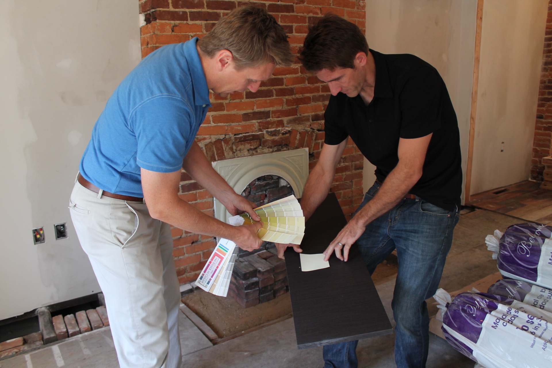
Designer Steve helped us figure out what paint suited our tastes and complimented our house. Mark would like the rowhouse to have a modern, industrial feel, but we didn’t want just white paint on the walls. We went for a color called “shark.”
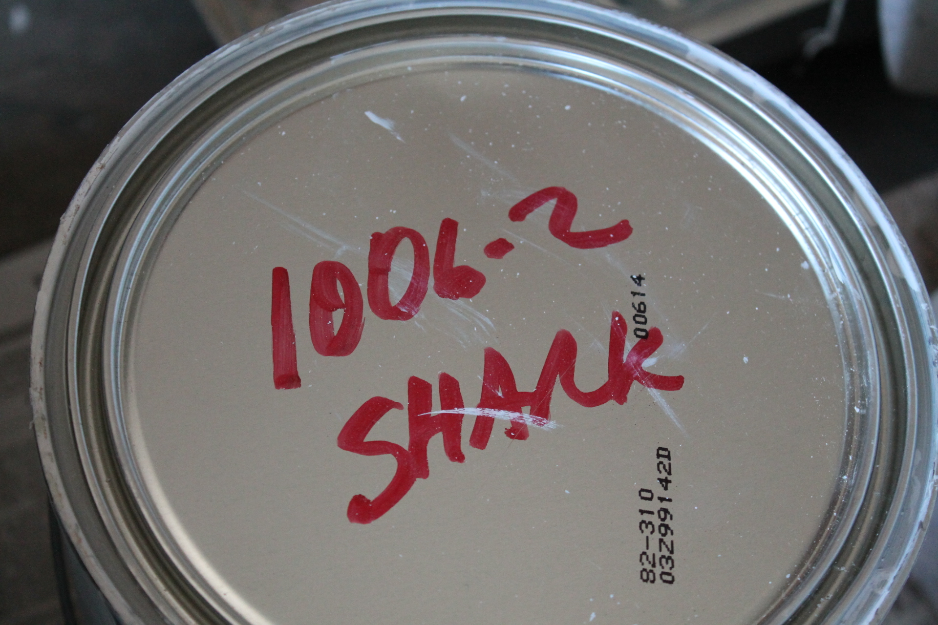
It’s more of a cool, gray neutral that Mark loves. I will say that my husband has quite the eye. I think the color is perfect and just what we were going for.
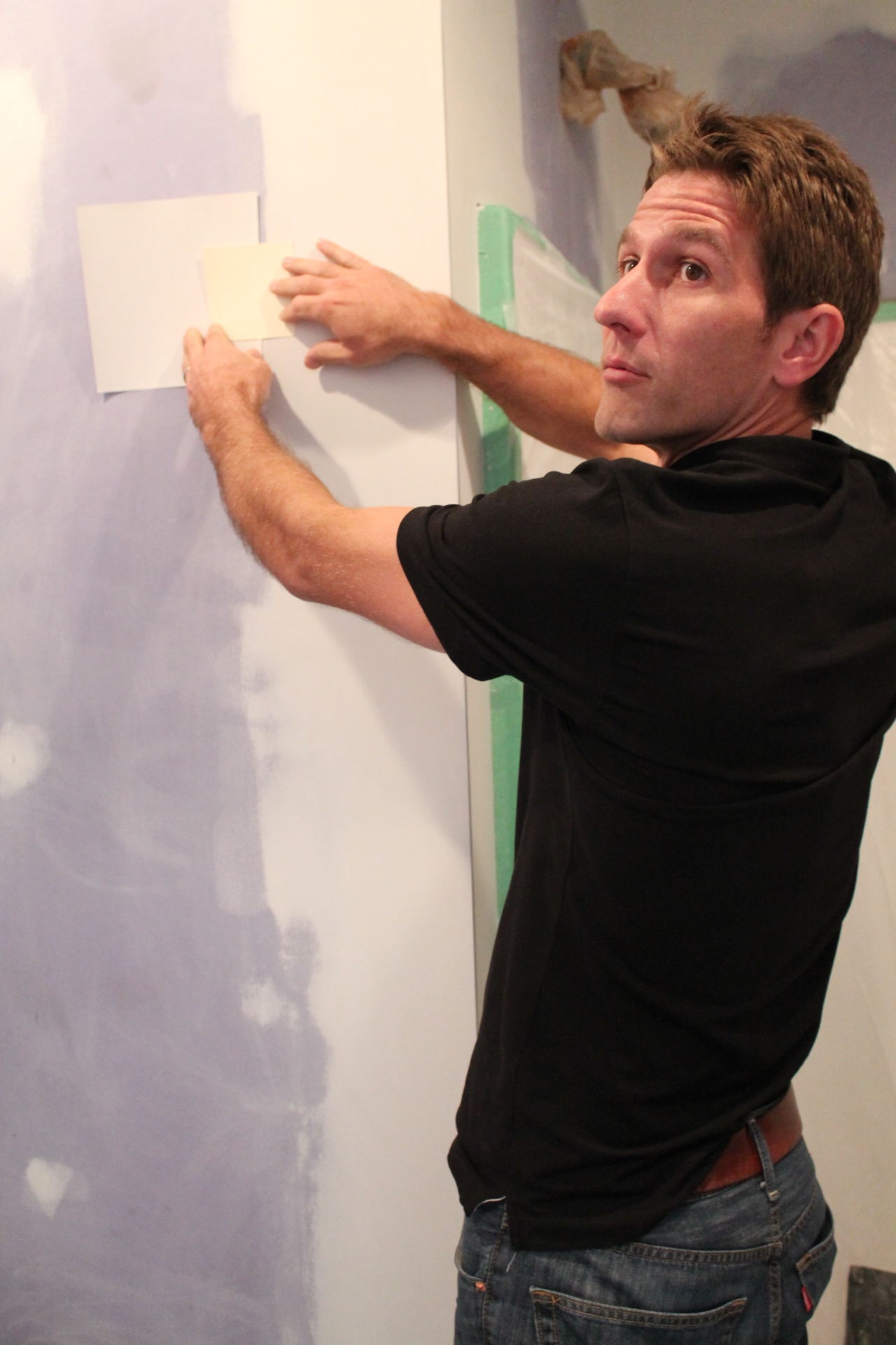
Our next decision was to pick a color for an accent wall in our upstairs hallway. We were going back and forth between orange and blue (I went to Syracuse University but that literally has nothing to do with this choice). We settled on orange.
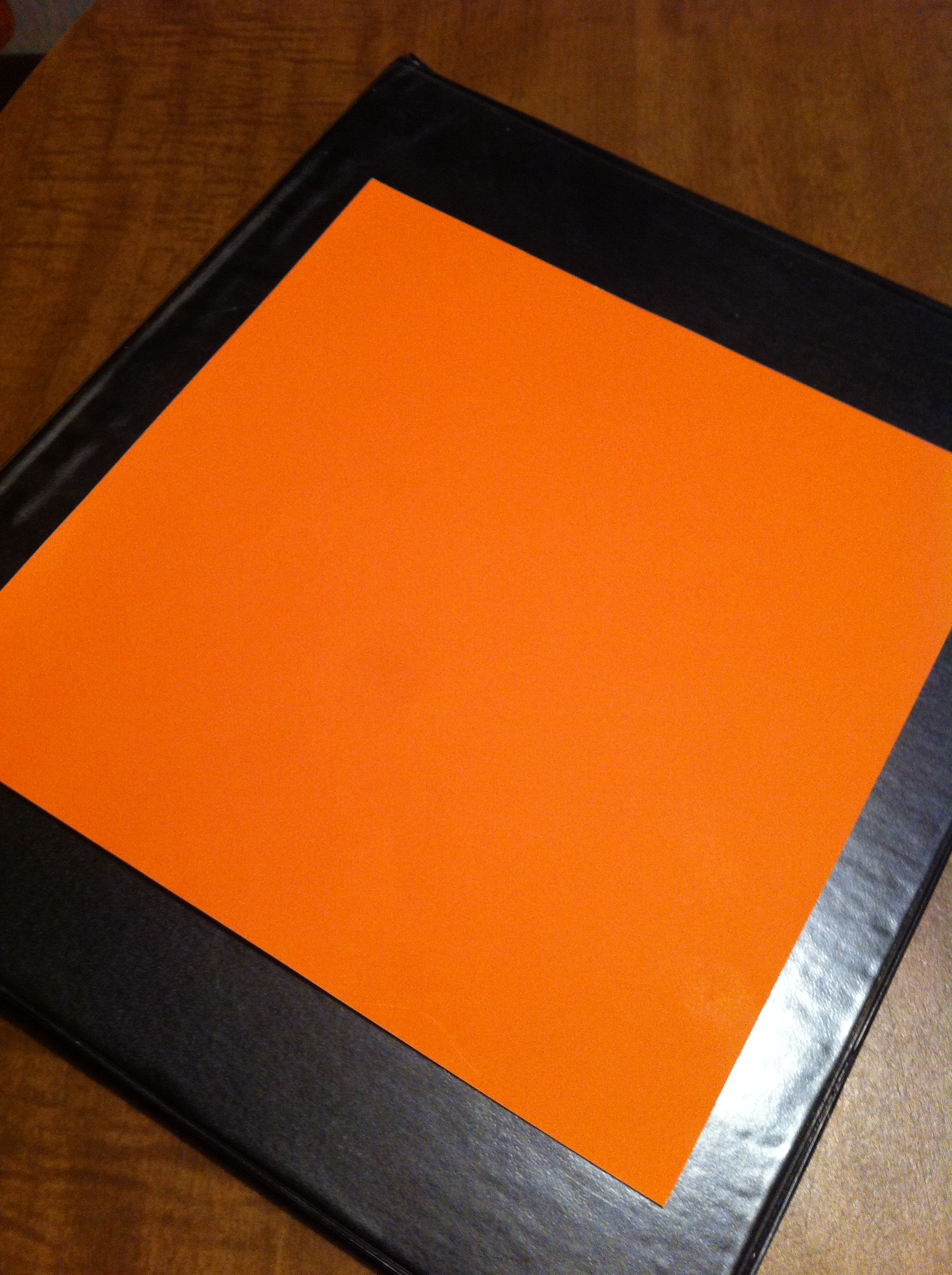
Here’s where it gets tricky. Our exposed brick isn’t red, it’s a pumpkin color. So, we want to compliment that while still making the wall stand out.
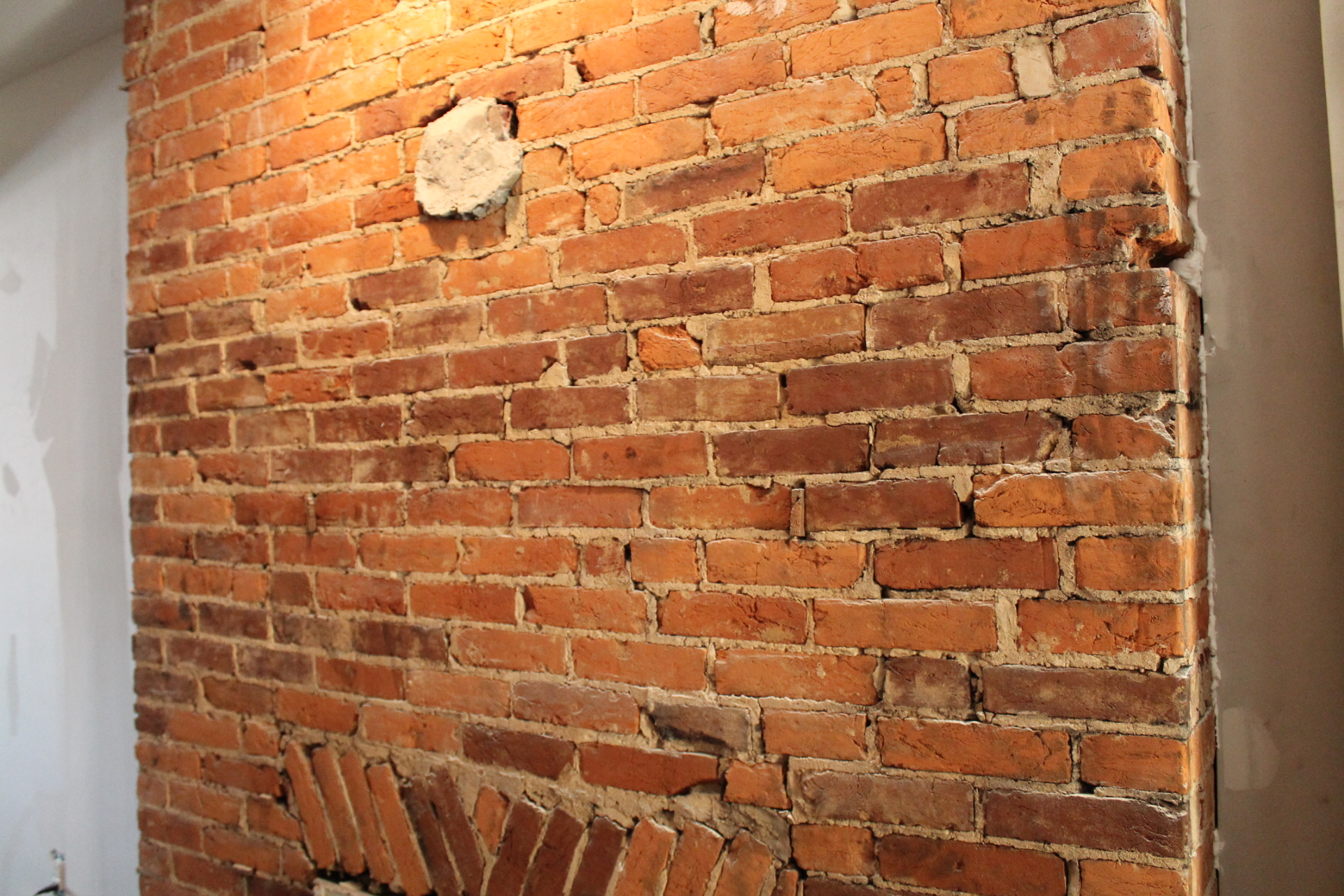
We decided to go with a shade called “Indiana Clay.” I feel okay about that because Notre Dame is in Indiana and I’ve always had fun when I’ve gone to ND football games.
And now you have some insight on how we choose our paint colors. If I like the name and can connect it to a fun memory, I’m sold! 🙂
**FOLLOW ILOVE2SWEAT! Just click the “+ Follow” button at the top of the page & put in your email address…some of you might see the FOLLOW button on the BOTTOM RIGHT CORNER of the site.
Let's Be Friends!
Subscribe to get my email updates so that you don't miss a thing!
Great colors!!!! They will work perfectly
Thank you! We hope so!